Thursday, 24 January 2013

Brave New World Part 3

Moving onto the inside illustrations now, I first tried trying to replicate what I did for the front cover by adding these simple black pen drawings over my existing photos as I wanted them to work as a set, however this didn't quite work. Here are a few of the initial ones I tried..


For the first image I chose to illustrate the part of the book where Linda dies in her soma coma state. I added the illustration over one of the suitable bubble photographs and messed around with the layer filters on each of them to try out different effects of blending the two together. The first one is more vibrant and my favourite of the set, whereas the other two are too wishy washy. I had to lower the opacity of the photograph quite a lot for the illustration to show and the overall result has made it too busy looking. I also don't think the ink works well with it.


I tried again by drawing out a simpler version with the black fine liner having liked the previous results for the front cover, I think these ones work a lot better.


The next part of the book I chose was the end scene where John savage hangs himself, I found it to be a very powerful part of the book, however it does not work AT ALL with the bubble photos and simply looks way too washed out, so taking a step back from using them and trying to make it all a complete set of images to match the cover I experimented overlapping my drawings on different photographs to see if I could achieve a more desired effect suitable for illustrating the book.

QUEUE THE FOG!

This was my saviour, I'd gone out during this project to photograph some beautiful mist and fog we got at home and they inspired me so much I thought why not try and use them for this.


I really like the graveyard ones and thought they would be perfect for the soma coma image, so I tried out a few before coming up with the final for it...


For these two I combined the two of the graveyard images together and iverted the drawing to make it stand out. I think these ones are really effective.


I also tried making it look really dreamy by photographing a moving light and changing the colours on photoshop, but this doesn't look quite right..


..So I decided on this for my final image, which is similar to the black and white ones, but with just the cross photo, but I prefer the colour.


 ....Moving onto the one of John savage, I took it a step further by introducing another photo on top of the fog one to give it more depth and help make it into more of an illustration.


I added the picture of the archway because of what it said in the book about walking through the door just seeing the feet hanging there and created various images around that idea. I like most of them, however the feet are far too thin and do not stand out at all so I drew them again in a thicker pen, inverted them as before and chose my favourite archway picture to put them in.


This is the final result.


For the final illustration I wanted to draw the part in the book where they first encounter the savages, so taking on board that a thicker pen works better to show up in the images I drew one of the savages in the dirt and placed her onto a photo from the fog photo set. As you can see the fog photo is really dark so I edited it on photoshop, changing the levels and curves to make it brighter before adding the drawing on top. 


This is the final image.


Brave New World part 2

As I found the bubble photos so successful, I instantly decided I wanted to use those for the front cover and possibly inside illustrations so I carried on experimenting with them by adding illustrations to them.


I first drew out these simple pictures of babies and DNA symbols as I thought about positioning them into the bubbles..


I thought these looked really cute and effective. I liked the idea of the baby fitting into the bubble as if it was growing in the womb or a test tube, but also having a lot of them all the same interlocking into each other on top of the bubbles to show the reproduction and how they are all the same.


Here's the DNA illustration on top of a simple colour rather than photograph, I was just playing around and found this too look quite simple and effective too. I was also messing around with sayings from the book and a favourite of mine is 'hug me till you drug me, kiss me till I'm in a coma. Hug me honey, snuggly bunny, loves as good as soma.' I tried experimenting with this phrase and the illustrations more as you can see here..


I like these ones because it looks as if the baby is in a sort of jail cell.


I also really liked the idea of fertilization and the bubble photo I took with a pin inside as I thought it represented that well so I drew a needle and using photoshop superimposed it onto an appropriate photo whilst also adding the title for the book. I could see this as the front cover. 


It was suggested to me that blotting paper may be a good way to illustrate the test tube babies as I like to work with ink and could be a more interesting way to illustrate other than just simple fineliner, however I found I couldn't work well with blotting paper and did not like the results achieved as I found they looked too childish and not sophisticated enough for the look I wanted. To be fair, I could have carried on with them, but I knew it wasn't the look I was after and gave up.


I finally decided on making this the final for cover illustration. I went back to looking at the original simple drawings of babies and after having a break from it and looking with fresh eyes, noticed how egg like this one photo looked and placed the baby images in, one fitting inside and one larger as I liked both initial images at the start where one fitted in but also the one where the drawing was too big for the photo. I think this balance works really well and gives a distorted look aswell as one portraying similarity in reproduction. I added some text to finish it off, I really liked this type face I thought it fitted well with the imagery and looked distinctly new and sci fi at the same time.


Saturday, 5 January 2013

Brave New World pt.1

For Uni we were told to read and illustrate Aldous Huxley's Brave New World. I found this quite challenging because it is not the sort of book I would usually read and found it quite a struggle to get through, however the film version helped a lot!
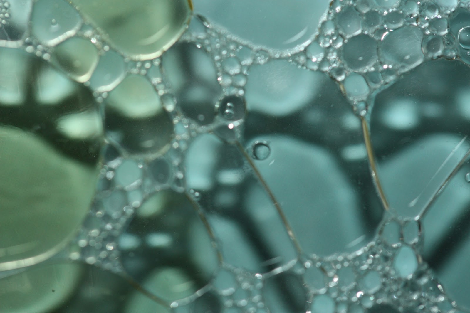
After scribbling down a few ideas I was one day photographing bubbles in water and oil, just for fun after seeing the talented work of Sharon Johnstone. I decided to have a bit of fun playing around with this technique to see if anything came out of it and I really liked the results!

These were my inspiration for what I was doing, by photographer Sharon Johnstone. I thought they would be good for this project as they instantly reminded me of the fertilization process which I linked to having to create test tube babies in the novel.


Here are a few of my results, unedited. I took a lot of photos so here is just a selection.


I tried these ones over a cd cover, this was at the beginning of the experiment and weren't very successful. I chose a cd that had a person on as I felt it related to the subject of human relations in the novel. I used a spotlight for the lighting of these ones.


These ones I feel were the most successful, these ones involved using natural light and a stainless steel basin for the background to create a metallic sci fi effect.


These ones were also very successful. I added washing up liquid to create a few more smaller bubbles, I also added a different coloured oil turning the water into this blue/green which fits well with how I envision brave new world.